Step one: Write a manuscript.
Step two: Edit the heck out of it. In fact, never stop editing. Every time you let somebody read it to give you feedback, edit the entire thing all over again. That is until The Mister entices you with bribes to just send it for once and not edit it beforehand. This may have happened yesterday. And I only edited a bit. Just the opening line. Because, I can't stop messing with it. Also, let it be known the Mister needs to up his bribe game.
For your FYI, the first line is called the hook. It's meant to hook your reader into asking questions, wanting answers, and keep bloody reading.
Step three: Publish. I guess.
Nope. Not even close. There's all these little details that follow writing a manuscript. You know, the minutiae you never thought about until right this second. And the step I'm talking about today is the shiny red ribbon perched on the package. That is to say, the cover art. The enticement for readers to choose your book over all the others they could read.
But, where do I go from here? How do I find a digital artist to turn my vision into reality. The web? Ha! Have you tried looking up that crap? There's a million and one web pages all devoted to E-Book cover art. Gah!
So, I figure, I'm an artist (insert scoff here). Just look at all my quilts and that one time I made a vest for my daughter's Annie Oakley project. I'll make my own darn cover art.
It's pretty great.
Pretty, pretty great.
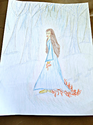
So, this was my first attempt. I was going for a mysterious lady in the snow packed woods. Barefoot. Whoa, right? With FIRE engulfing her. I wanted it to be mainly white-ish in the background so my girl would stand out.
Problem. She's more standing in profile when I wanted her looking behind her back coquettishly. And The Mister said he didn't like her skirt on fire. That, instead of looking magic-y she appeared as though she was actually on fire.
That prompted effort number two.
Okay, yeah. Yeah, this is pretty good. Aside from the fact I drew her too big so had to add another piece of paper. But, I've got the Little Red Riding Hood thing going on which I like. Still barefoot and now looking over her shoulder, though not right at you as I had wanted. Hmmm, eyes are complicated.
And her smile needs to be more enigmatic. Like she's got a secret that you're just dying to figure out. But the only way to learn more is to BUY THE DAMN BOOK!
The Mister says he likes this one, but likes the first one's perspective better. That is, her standing further back, more in the distance, almost swallowed by the woods.
Whatever. We've had drawing contests before and I'm always the winner. I'm thinking just maybe I should find an actual graphic designer to turn this into a more photo-realistic image. Maybe. I'm still thinking about it. What do you think?
Also, do you like image A or B?
Thanks for reading!


